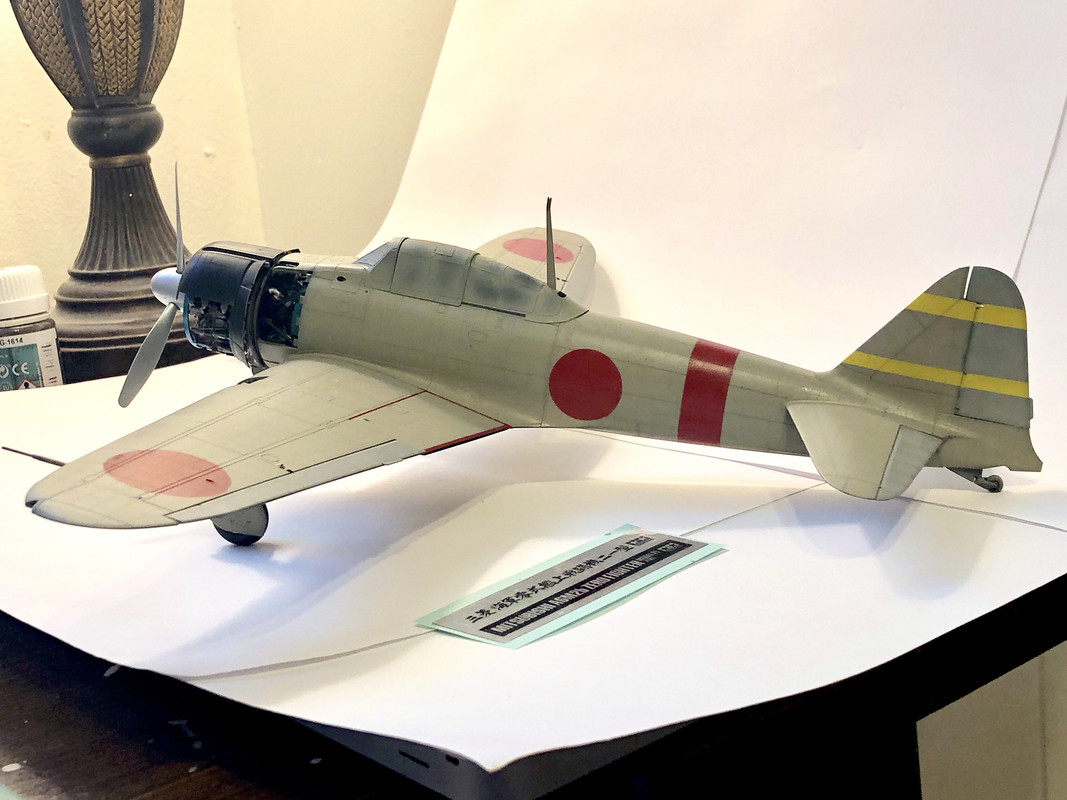
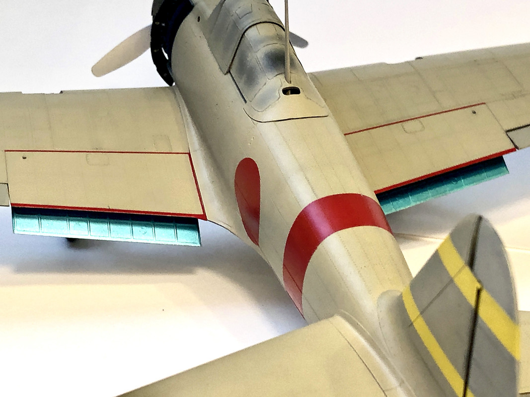
Duke Maddog wrote:Good to know Kenny. I get the same results from my mixture of Windsor Newton Oils and Mona Lisa thinner. Still, I don't get the final excellent results you do; I guess I'm just not that skilled at it....yet.
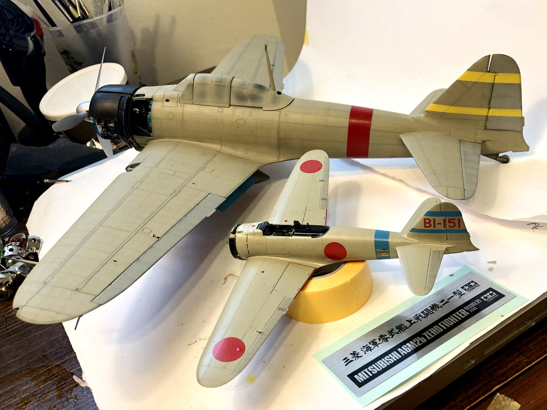
"Mother Zero and her youngest..."


Big Duke,
It takes a little while to get the hang of it. When I do washes with oils, I try to use as little paint in the mix as possible, and I go section by section slowly, bringing each line up little by little, as precisely as I can. It does take practice. And lots of patience.
mostrich wrote:Mother Zero and her youngest. I love it. Also love the tonal variation on "ma". You pulled that off perfectly.
Mos,
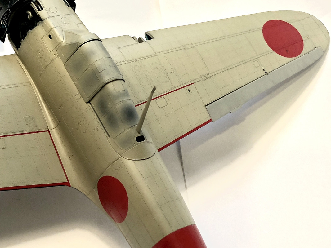
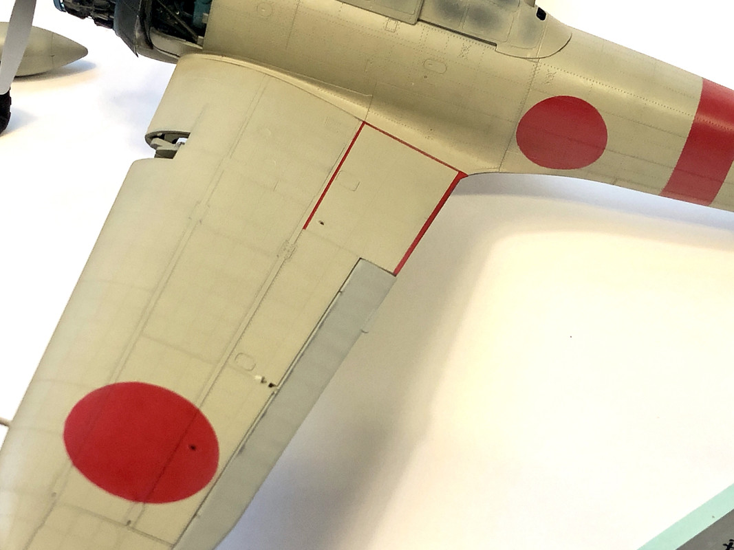
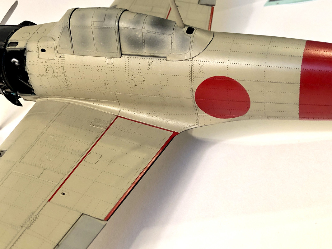
Thank you again for that! HOWEVER- I actually opted to add a few more blend coats to the bird. Here’s what happened—
I’d decided to give the 1:72 Zero a rest because I want to focus on completing the 1:32, and also because I’ve decided that I dislike the color red for the insignias and no walkie lines on the 1:72 and I need to decide how I wish to proceed on correcting that, or if I even want to. And that’s fine, the 1:32 Zero needs some attention.
So I’m hard at work measuring the areas I’ll be making the masks for. And I’m looking at the finish I got on the 1:72 Zero and comparing it to the 1:32. And while I agree with you- that tonal variation was lovely, I couldn’t help feeling like it was a little overdone and lacked more of the subtlety I’m going for. It looked just a shade or two “too used” for my liking. I wanted to bring up the smoothness, shine, and subtlety of it to make it more like my 1:72 version.
So I thought more about it while cutting masks, and here’s what I came up with—
1. I knew the Ameiro on the 1:32 wouldn’t pop and shine as much as the Ameiro on the 1:72, because I silver based the 1:72 variant and black based the 1:32. This is A-OKAY. I figure the larger of the two might end up looking way too “new” without at least some depth in the paint. Plus, the little guy is so small, I say let the 1:72 pop and shine more, why the hell not? Little airplane, BIG personality. Like a Patterdale Terrier.
2. I very gently polished the paint on the 1:32 with microfiber pads, going from 4000 to 1200.
3. Once she was nice and smooth (the existing thin clear coat that was already there helped tremendously with that) I took super thinned Kustom Ameiro and applied the blend coats very carefully.
4. After the paint set up, I did more microfiber polishing.
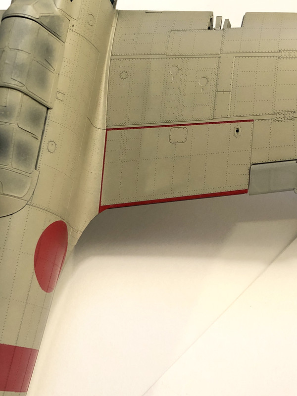
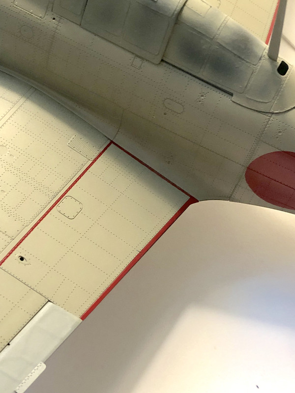
Here’s the results:
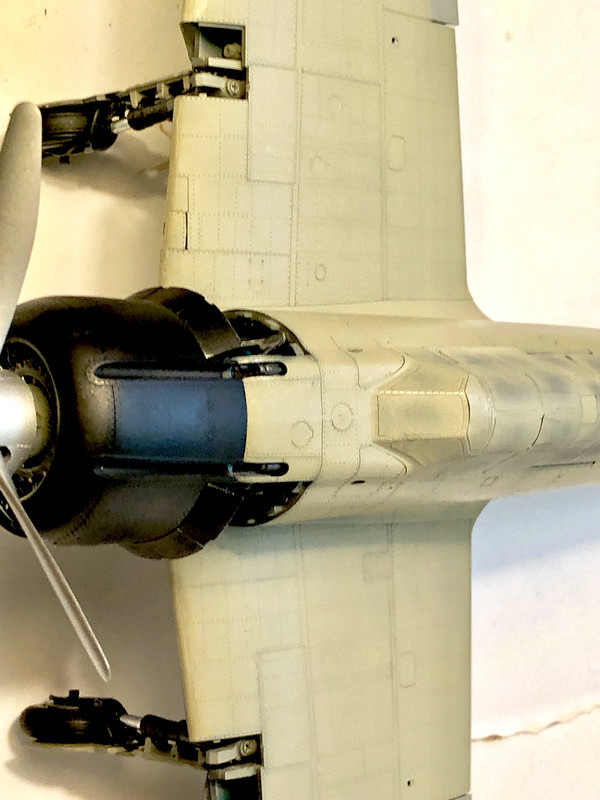
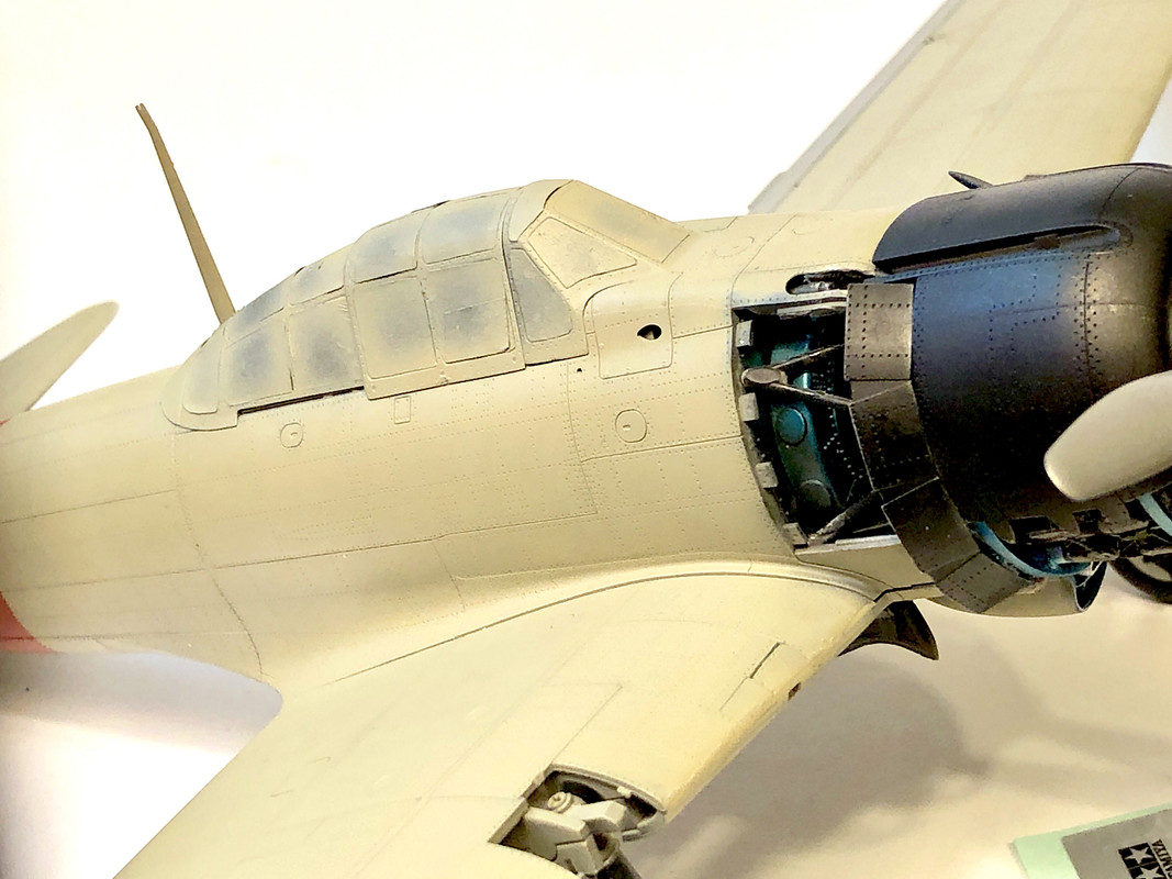
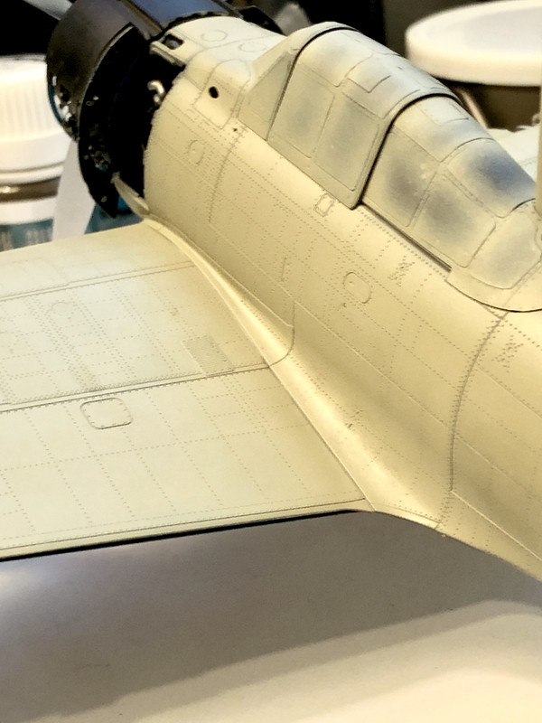
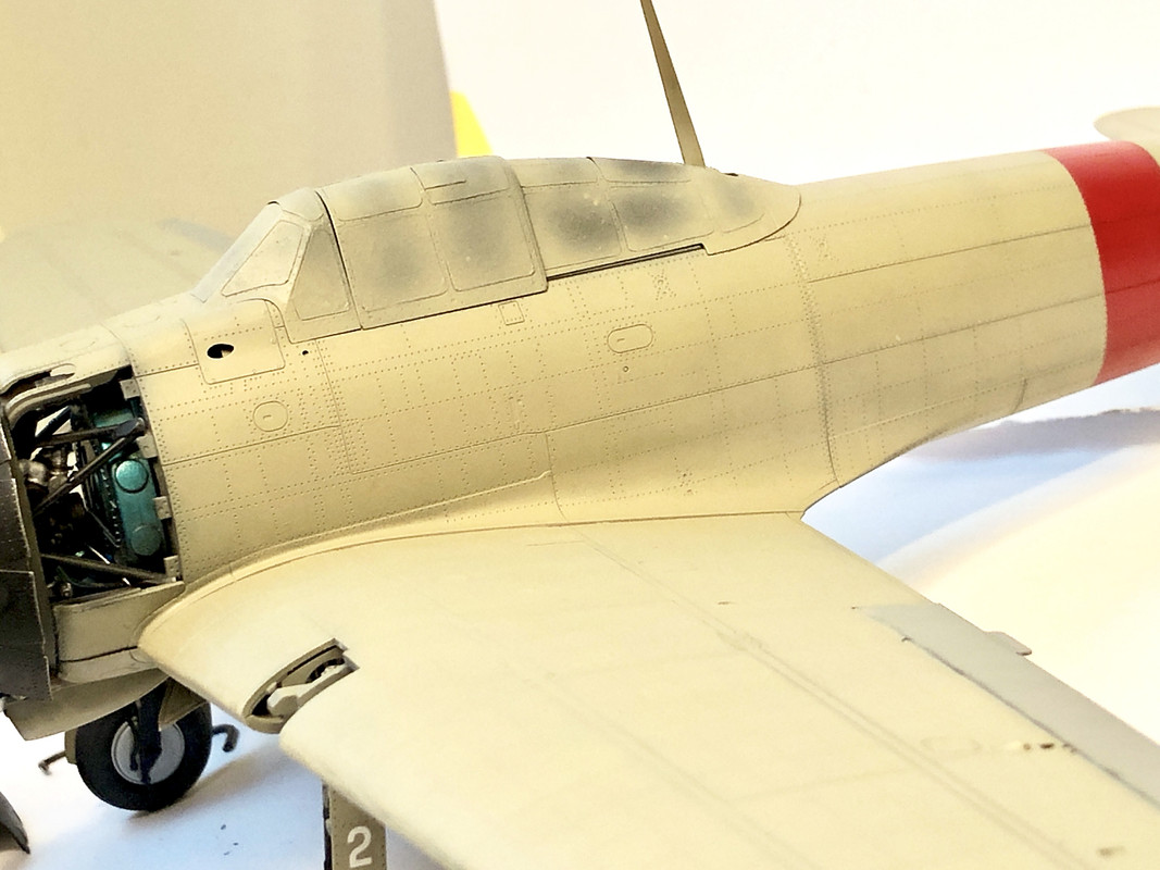
I like this much better. Yes, there is far less contrast in the paint, but there is still some nice depth. And I’m also pleased with how the rivet patterns have been tamped-down, as the Neutral Brown wash I plan on applying will bring them up to just where I want them, same as it did with the panel lines on the 1:72.
It looks less used now, the color is smoother, and while I lost about half to maybe two-thirds of the tonal variation, there is still depth. And since the Japanese Navy babies these aircraft and treated them with almost a reverence at the start of their participation in the war, this fits with my vision just fine.
Okay, masking and painting insignias and no walkie lines commences soon! Probably even later tonight or tomorrow!

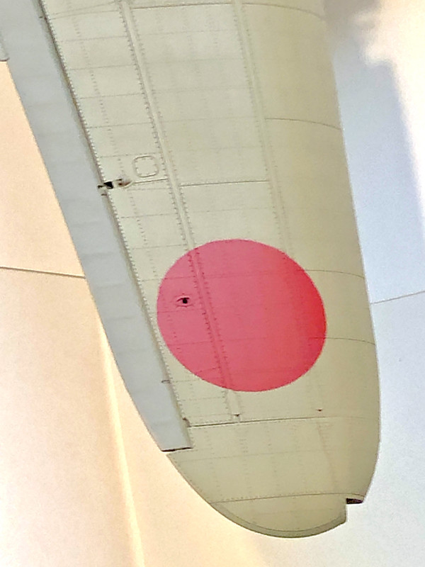
this white bird is scale 1/72 !