speedgraflex wrote:The adjustments you made to the surface finish are impeccable. I am going to add that I am quite in agreement and alignment with your reasoning behind the approach itself, as real painting is achieved with far smaller color blocking then most modelers attempt. Your approach leads away from an overall wash of color to create the much smaller variegation effects which are present in reality. I do think there is quite an enormous improvement between initial color and adjusted one—particularly in the yellow or cream tone, easily overdone, is in better proportion to the actual painted skin of the aircraft. “Wax on... wax off” becomes “Paint on... paint off.” Beautiful adjustments.
Splendid work.
Bruce,
Thank you very much! You just articulated what was going on in my head at the time, and what I’ve been bandying about in my head after the fact leading up to the subsequent blend coats way better than I could.
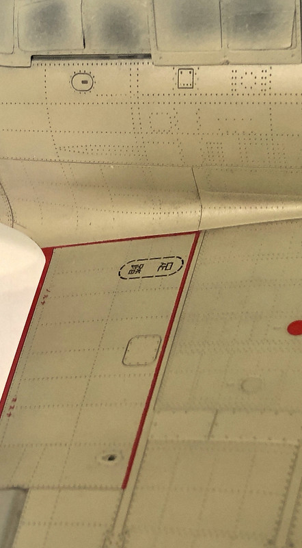
Have a look here, this is a blow-up of the aircraft’s surface very early in the painting process:
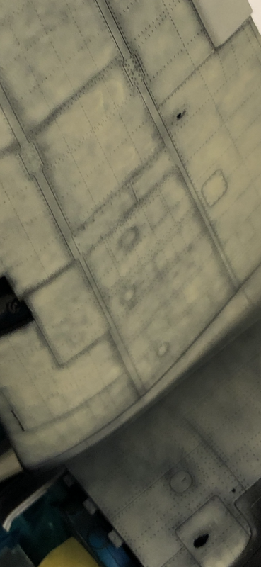
You were right on the money with what you said about the color blocking and variegation. I was absolutely attempting to re-create that on this aircraft. And what you see in that photo is me, using the intersecting rivet lines as a grid, building up the paint meticulously tiny section by tiny section. I first mottled-in a very heavily-thinned, unadulterated base color, tiny rectangle by tiny rectangle. Next, I lightened that color very mildly and mottled that in, tiny rectangle by tiny rectangle, and then lightened it a little brighter, and mottled that in. I used the smallest spray pattern I could. Super-Clean airbrush, needle just a millimeter or so above the surface. Tiny, translucent dot. Paint so thin it would almost bleed. And I built it up that way, keeping in mind to make the resulting tonal variation on as close to a “micro level” as I could get it. And you can see, I was avoiding river lines and panel lines in a relaxed way. I didn’t want a pre-shade effect per-se, it’s more like I wanted a very, very subtle call-out, once the blend coats were done, and we’re talking “practically imperceptible” here. But yeah, if you just thought “Holy crap he painted that with three or four thin layers of paint mottled into quarter inch rectangle by quarter inch rectangle” you’d be correct. And it took many hours.
After that the blend coats came. I used the heavily thinned, unadulterated base color for that. I wanted to avoid the “Tartan Quilt” effect you hear modelers talking derisively about, I wanted subtlety, and I wanted smoothness along with some nice depth. I wanted to lose about 70% of the variation, knowing that, just as you said, the cream hues won’t be present in their proper proportion if there isn’t enough paint on there. The first result looked great, but it looked too used to my eye, and the cream tones weren’t pulling through enough. NO PROBLEM. Just a few more thin blend coats got the job done.
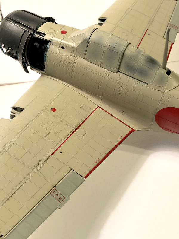
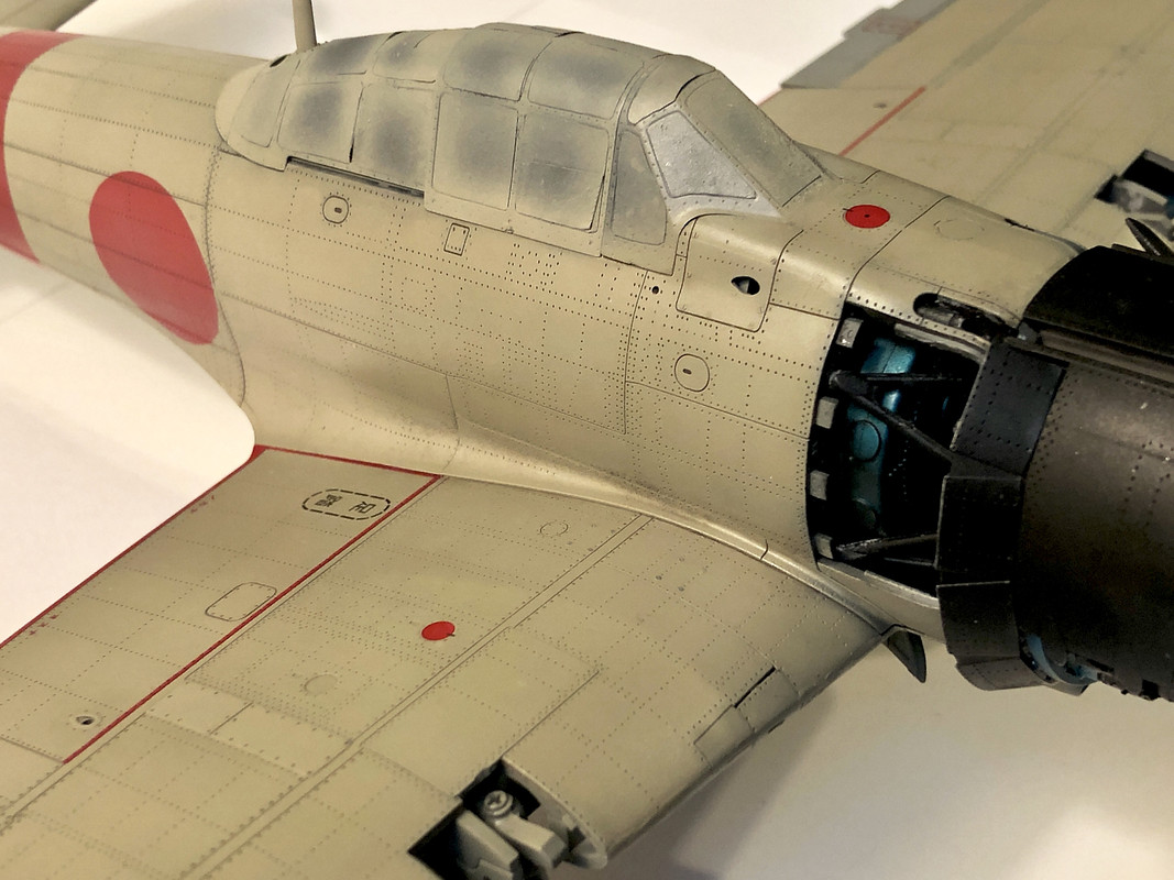
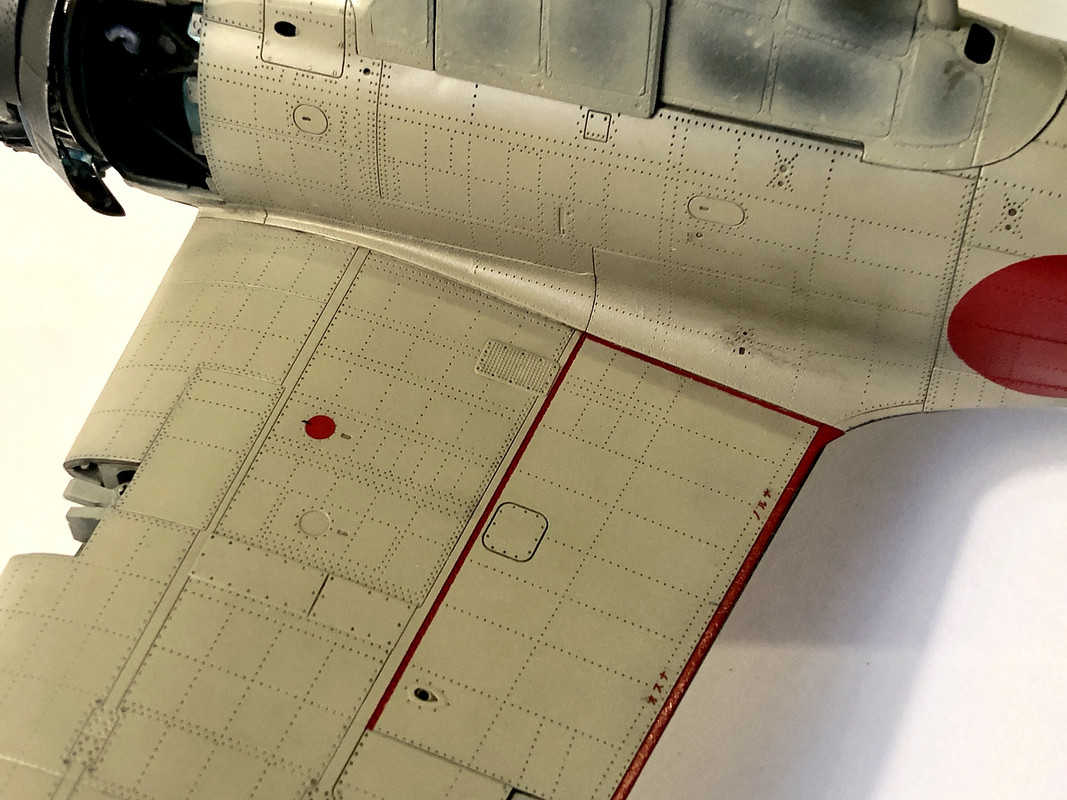
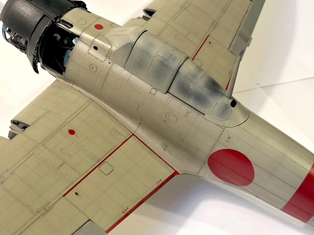
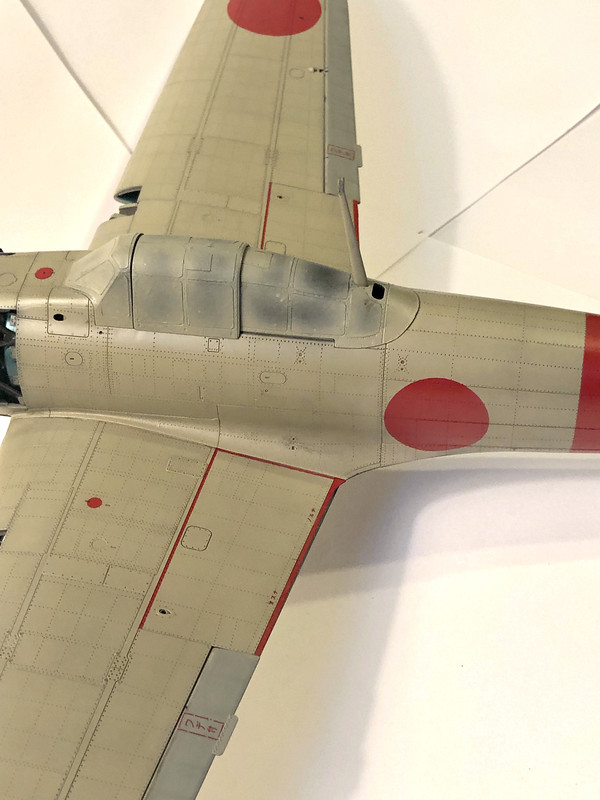
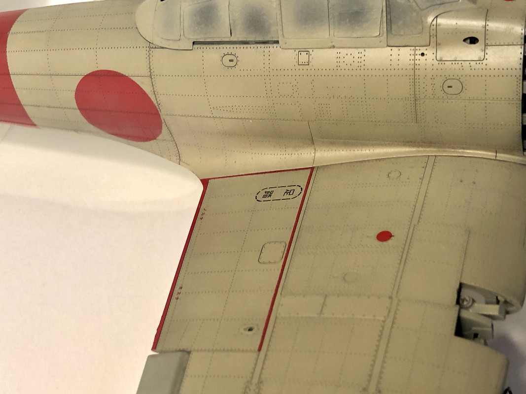
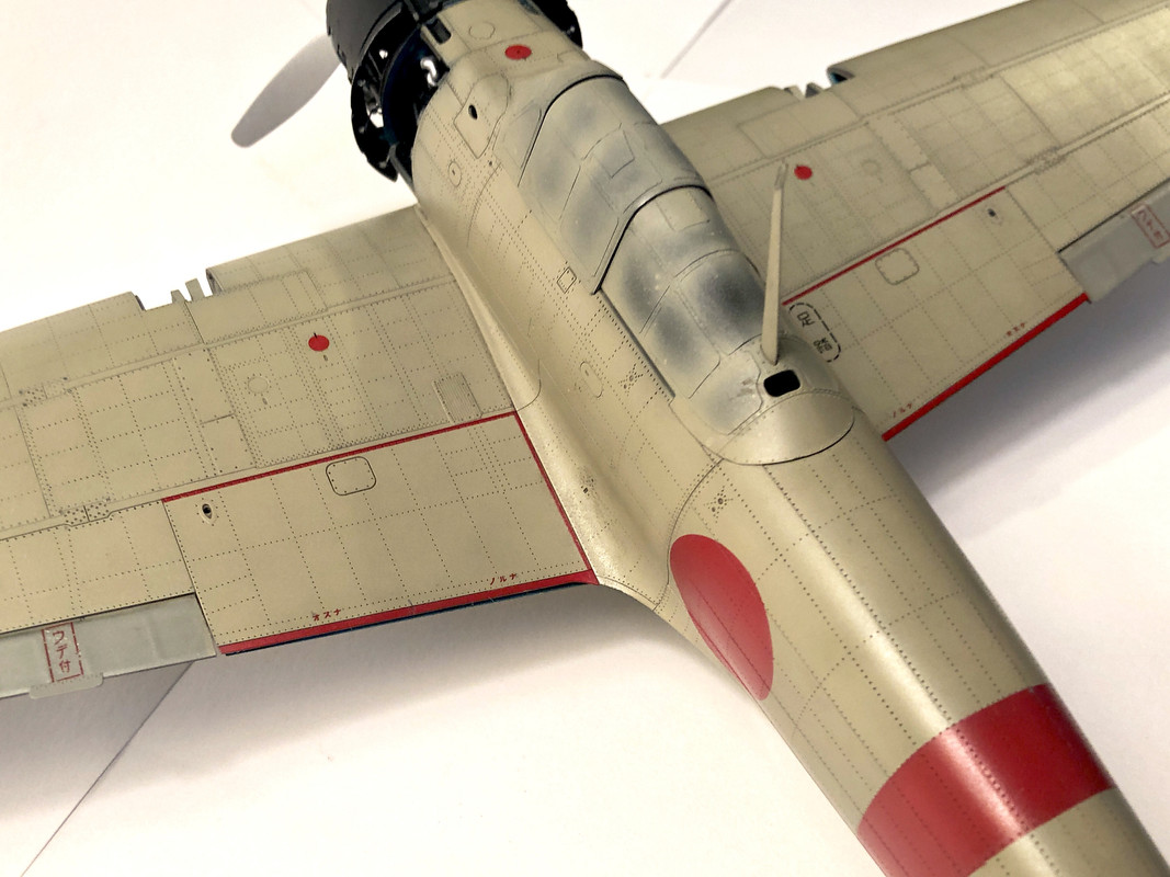
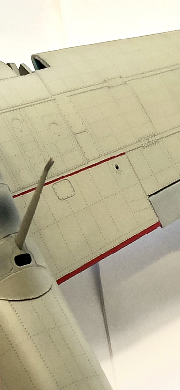
Here’s a close-up of the port wing after the clear coat has set up:
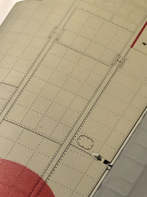
As you can see, the tonal variation was knocked back quite a bit, but again- practically brand new aircraft which was literally babied by the Japanese Navy. And there is still some depth and tonal variation in the paint, along with barely-perceptible called-out surface detail- rivet lines and panel lines —and those’ll look LOVELY when washed with the Mig Neutral Brown.
This was a tricky balance to achieve and I’m relieved that that part is done

Anyway, thank you for your comment. It was gold. You nailed exactly what I was trying to do.